Matter Figma design system: free to duplicate, study and adapt
Matter is our own design system, published free on Figma Community. Duplicate it to see how we name colour, spacing and type values, assemble components from smaller parts and organise a library so designers can find the right piece.

What's inside: a Figma design system with purpose-named tokens
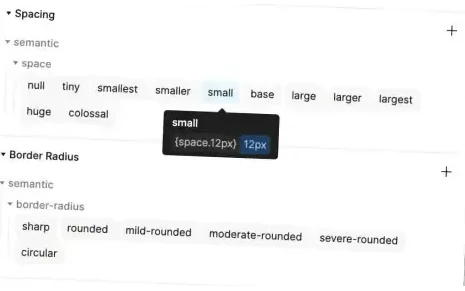
Tokens named for their purpose.
Tokens are a design system's named colours, spacing and type sizes. Matter names them for how designers choose between them, so the right one is easy to recognise.
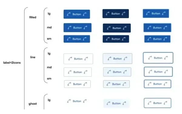
Components built from smaller parts.
Larger components are assembled from smaller parts, and each has options for its different states.
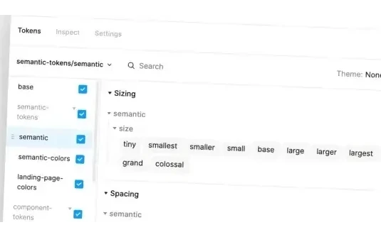
Naming you can follow.
Colours, spacing, type and components share one naming scheme, and the library is organised so related pieces sit together.
Duplicate Matter from Figma Community and take it apart
Duplicate the file, open a component and follow how a foundation value flows into the finished piece. Use it to learn how a design system fits together, or as a starting point for your own.
Treat it as a study copy: published as it stands, and yours to learn from and adapt.
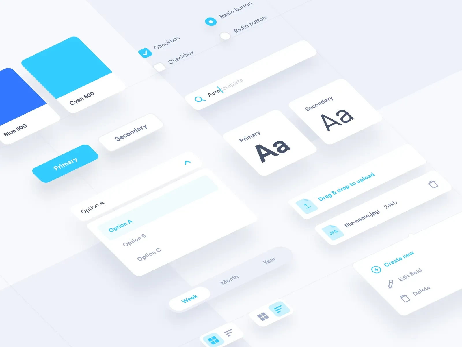
What a working design system adds to a Figma file
A Figma file alone does not stop a team shipping a one-off button. A working design system can, because someone owns the answer and every product team has agreed to follow it.
That takes owners, shared names, coded components, documentation, a way to contribute, releases and migration. Matter shows how we name and organise the basics of a system. The rest is built around your product and your teams.
Design systems are also gaining a new reader. AI tools that generate screens and code build from whatever names, rules and states a system gives them. A system described clearly enough for a machine to follow keeps generated work looking like your product, and purpose-named tokens like Matter's are where that starts.
Get help with your own design system
Tell us about your design system
Starting one, repairing one or getting teams to use the one you have: tell us where things stand.
Questions about the free Matter design system
Is Matter free to use?
Yes. Tcules offers Matter free on Figma Community under a CC BY 4.0 licence, as shown on its Community page. You can use and adapt it, provided you credit Tcules as the licence requires.
Does Matter include working code?
No. Tcules made Matter in Figma. When a team needs working components in code, with a Storybook catalogue that matches its Figma library, we build them as part of Design System Implementation.
Can we build our product on Matter?
Yes, you can start from it. Your product's system still needs its own colours, components and code shaped around the product, plus people who keep it current. Tcules can help you adapt Matter or build your own.