Case study hero background image

Benchmark Gensuite

Benchmark Gensuite — Modernising a 75+ application enterprise suite

COMPANY

Benchmark Gensuite

SECTOR

Enterprise EHS, sustainability and operational-risk software

THE WORK

Legacy product modernisation and scope selector interaction redesign

Problem

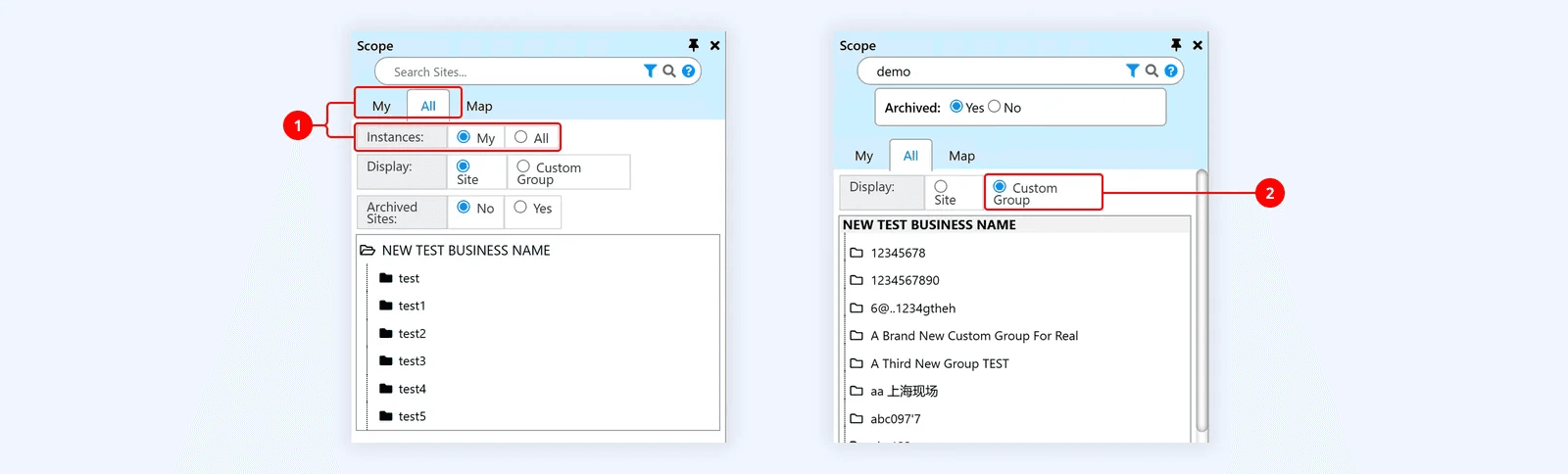
Benchmark’s established 75+ application suite used dense, dated interfaces without a coherent visual hierarchy or shared modern design language. The challenge was to modernise the experience without disrupting the robust workflows underneath it.

Solution

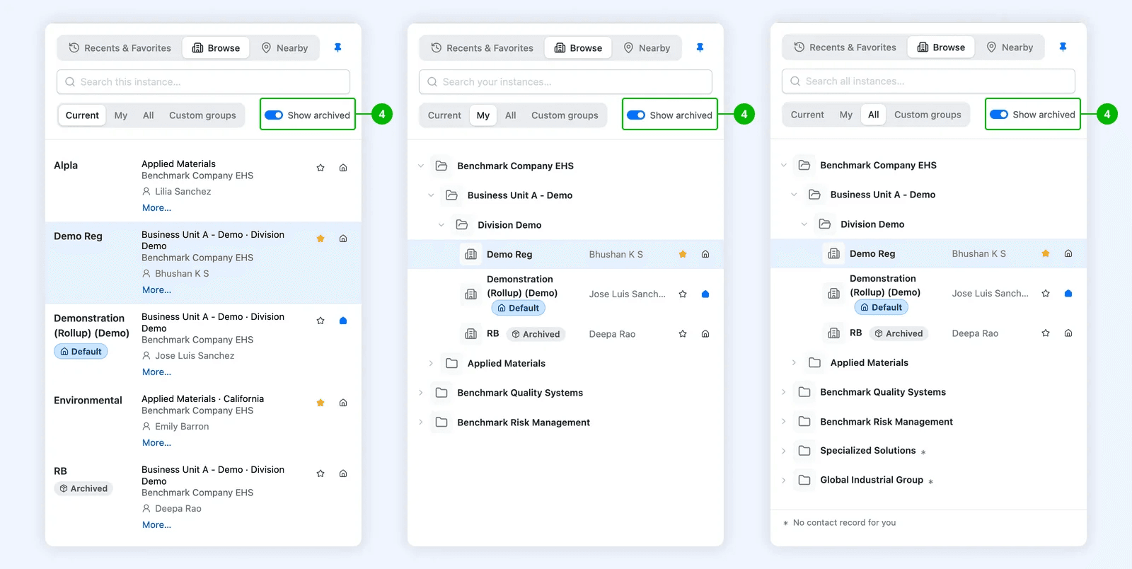
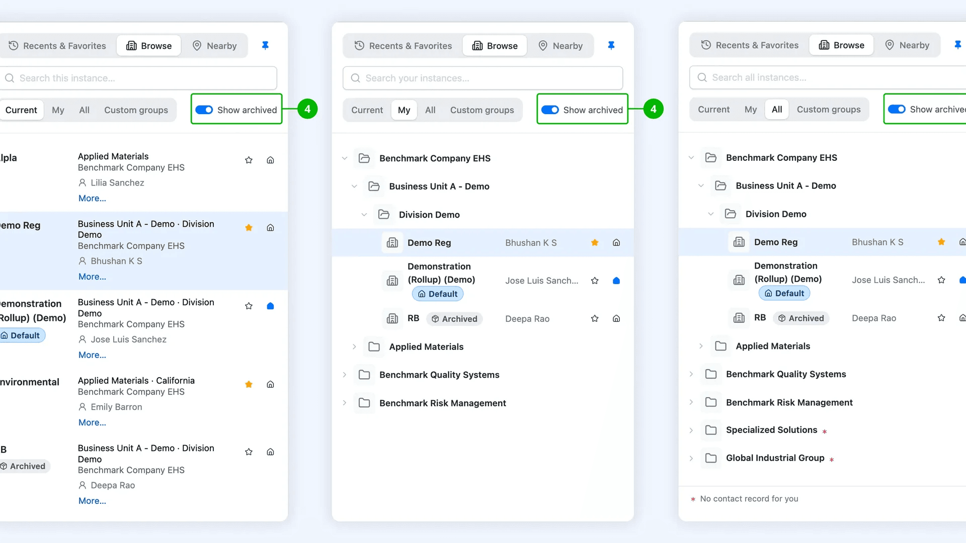
Tcules defined a Bootstrap 5.3 design language and reusable component approach, then tested it through high-reuse modules such as attachments: a sidebar-based file and folder manager with reordering, nesting and complete upload states.

01 / THE SCALE OF THE PROBLEM

Seventy-five products cannot be modernised one screen at a time

Benchmark Gensuite is an established enterprise platform spanning more than 75 applications across environmental health and safety, sustainability, quality and operational risk.

The interfaces carried complex filters, forms, data tables, charts, widgets and action workflows. The underlying product architecture was robust, but the visual language felt dated and inconsistent.

02 / THE REAL QUESTION

Does AI sit inside the dashboard, or decide what it shows?

Two directions were credible. A dashboard with an AI assistant was familiar and predictable. AI helped users operate an interface whose structure remained fixed. An intent-led dashboard allowed the request to determine which KPIs, assets, charts and twin views appeared. Neither was sufficient alone. A fixed dashboard could not adapt across roles. A chat response could not provide persistent context and direct control.

03 / THE DECISION

Conversation determines intent. The dashboard remains the workspace.

Conversation established what the user wanted to understand. The product then assembled a persistent workspace around that intent. Users could continue in natural language or work directly with the controls, charts and twin.

THE PRODUCT DECISION

The product did not replace the dashboard with chat. It used conversation to construct the right dashboard for the situation.

04 / THE WORKED EXAMPLE

A file manager, not a prettier attachment modal

The attachments module made the system-level approach concrete. The old modal-based interface was dense and offered no clear file or folder organisation.

The redesigned module became a sidebar-based manager with drag-and-drop reordering, nesting and unnesting, clearer hierarchy and explicit empty, uploading, error and completed states.

05 / THE DECISION

Preserve the workflow; change the hierarchy and interaction model

A new designer might have assumed that a dated interface required a wholesale workflow redesign. In this case, the product model was already strong.

The design therefore preserved established workflows while improving information hierarchy, component consistency and the organisation model where the existing attachment pattern was genuinely limiting.

06 / WHERE IT STANDS

An approved direction, not a measured production outcome

The attachments module was approved within the client’s one-week review window, and the broader engagement was extended for another three months.

The available material does not establish production adoption or measured user impact across the suite. The interaction details and implementation fidelity remain dependent on Benchmark’s internal development work.

WHAT THIS PROVES

Modernising a large enterprise suite is a design-systems problem.

When shared components and high-reuse modules are designed together, one coherent direction can improve many products without forcing every workflow to be reinvented.