Problem
The existing Shopify website was not user-friendly, lacked powerful search and navigation, and limited accessibility to key product details, affecting online conversions.
GT Tools
COMPANY
GT Tools
SECTOR
E-Commerce
WHAT DOES THE COMPANY DO
Windshield repair tool manufacturer
The existing Shopify website was not user-friendly, lacked powerful search and navigation, and limited accessibility to key product details, affecting online conversions.
Redesigned and developed a customer-friendly, accessible Shopify website with improved search, product navigation, detailed product pages, sticky headers, and support widgets, creating an intuitive, conversion-focused e-commerce experience.
GT Tools has been in the automobile industry as a windshield repair tool manufacturer for over 34 years now. They’ve been conducting their business both online and offline and it was only recently that their online revenue surpassed their offline one.
This got them to consider having their current website based on a low code platform like Shopify redesigned.
They approached us with the project and with our expertise in low code platform design, we helped them design and develop a customer-friendly and accessible website with a powerful search feature.
Being a Shopify redesign and development project, we had to take into account the limitations and roadblocks we would face during this low code platform design assignment. The next step, before we proceeded to the stakeholder interviews, was to perform a heuristic evaluation. This was to avoid any bias seeping in when understanding the system, and to have an objective opinion of its usability.
This was followed by multiple stakeholder interviews, and product audits performed parallelly with competition analysis. The last stage was to synthesise our findings, prepare a report and present it to the client. In this report, we also shared the potential issues we would face during this low code platform design and how we planned to fix those. We concluded the Audit understanding what would be needed to make this Shopify redesign more user-friendly and conversion-centric.
In modern eCommerce website design, the homepage is no longer the only entry point for new users. So, we decided to use the homepage to build a narrative to introduce users to the brand. What helped us in creating an efficient narrative was understanding the business and its owners.
This, paired with introducing important CTAs throughout the narrative, helped guide the user’s journey. We also used improved pictures and iconography to present the brand in a fresh and minimal aesthetic.
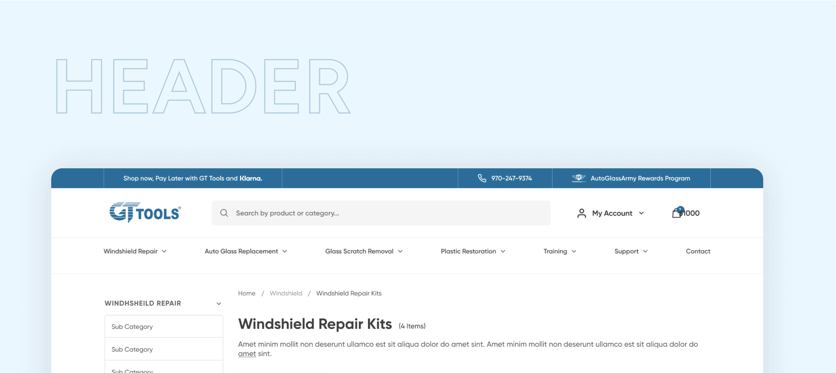
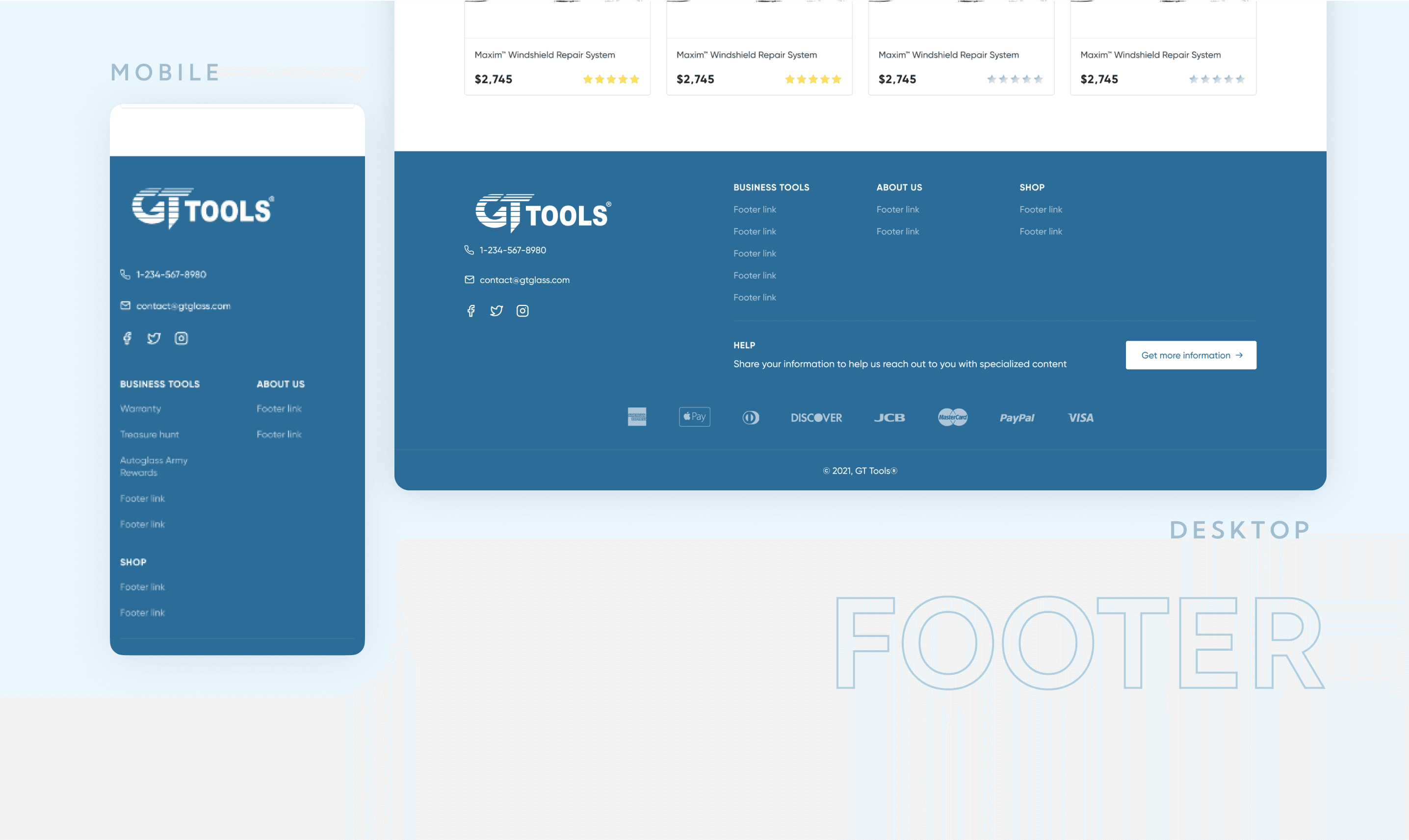
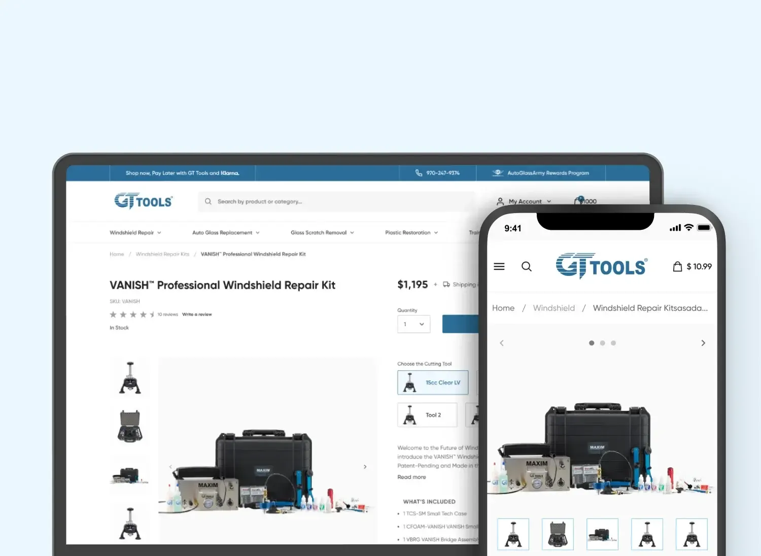
As part of the homepage revamp, we also redesigned the header and footer sections. The new header had an improved search function that would be an important navigational tool for users.
Additionally, we also introduced an information strip above the header. The purpose of this strip was to show current, relevant and important information – sales, festive offers, delivery delays etc. It would be visible at all times, showing beneficial information to users.
The product list page was another important touchpoint in the user journey. Optimizing it efficiently was important because users on the product list page always represents a stronger intent to buy than users on other landing pages. We improved a few key features of the product list page:
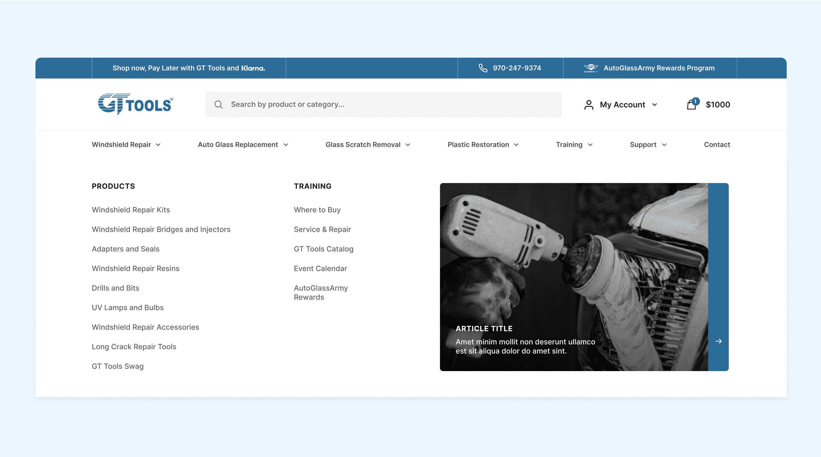
Given the nature of the client’s business, there were a lot of categories available for users to narrow down their purchase choices. We improvised the category navigation on the left panel so users can easily switch between categories.
One of the most undervalued sections on the product list page is the section mentioning the product’s category and description. It serves as an important anchoring point for users and also hosts important links to learn more about certain product categories. For example, the manufacturing processes or quality standards etc.
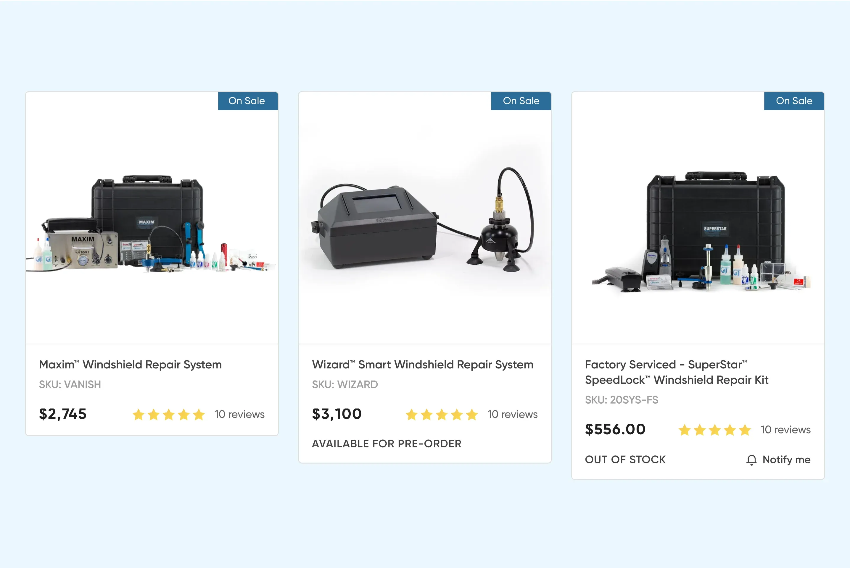
The most obvious improvement that we made was the product lists on the listing page. We added unique elements like Out of Stock indicators, Pre-order indicators, SKUs and tags that are not widely seen across eCommerce stores.
It was important to add SKUs because certain users might want to use SKUs to search for physical distributor catalogues for certain products.
The product detail page is arguably the most important part of eCommerce website design and the user journey. This is the point where the intention to buy a product often reaches a tipping point.
Hence, it was important to present all relevant options and details to help users make an informed decision. During this Shopify redesign, we added a few key features:
Some products have configurable parts but it is generally difficult to access, change and compare them. The visual selector/switcher that we designed would let the users easily switch between the different available options with minimum delay.
This was a challenge to implement owing to the close ended nature and technical constraints Shopify has . However, our experienced developers were able to fix this with their expertise in Shopify development and minimise the delay.
With most eCommerce stores, a lot of product details are hidden under the “Read more” dropdown. However this information is key when users are trying to make a purchase decision.
With our redesign, it was important to us that users could keep looking at the information at the top of the page while parallelly diving deeper into more detail if they wanted to.
As far as expensive purchases are concerned, most people prefer having all the needed information about a product or talking to a human first. We address this by introducing a widget to quickly access product information or talk to customer support.
Most eCommerce websites reveal the shipping and warranty details only after a long scroll down the page. This often acts as a bottleneck in establishing transparency and gaining trust of the user. To make this eCommerce store more user-friendly, we made these details easily accessible at the right point in the user journey.
The insurance widget active on the site was functional, but not very useful. Our audit revealed that buyers of products priced on the higher side may want to investigate financing options. With this information, we designed the page to provide answers sequentially to questions already on the user’s mind.
Because of the detailed information available on eCommerce websites, the pages can sometimes be a bit lengthy. We wanted the users to see the product’s price alongside the CTA to Add to Cart. To solve this, we designed a sticky product header that would follow the user as they scrolled down the page.
Through our expertise in Shopify development and low code platform design, we optimised & delivered a scalable eCommerce website that provides enhanced accessibility and an intuitive user experience. Users can now effortlessly find products using powerful search features, get their potential questions answered proactively, and gain easy access to customer support. With a strong focus on usability and conversion-centric design, this Shopify redesign project sets GT Tools up for continued growth in online revenue.
Contact us to see how our UX design and development solutions can elevate your eCommerce business.