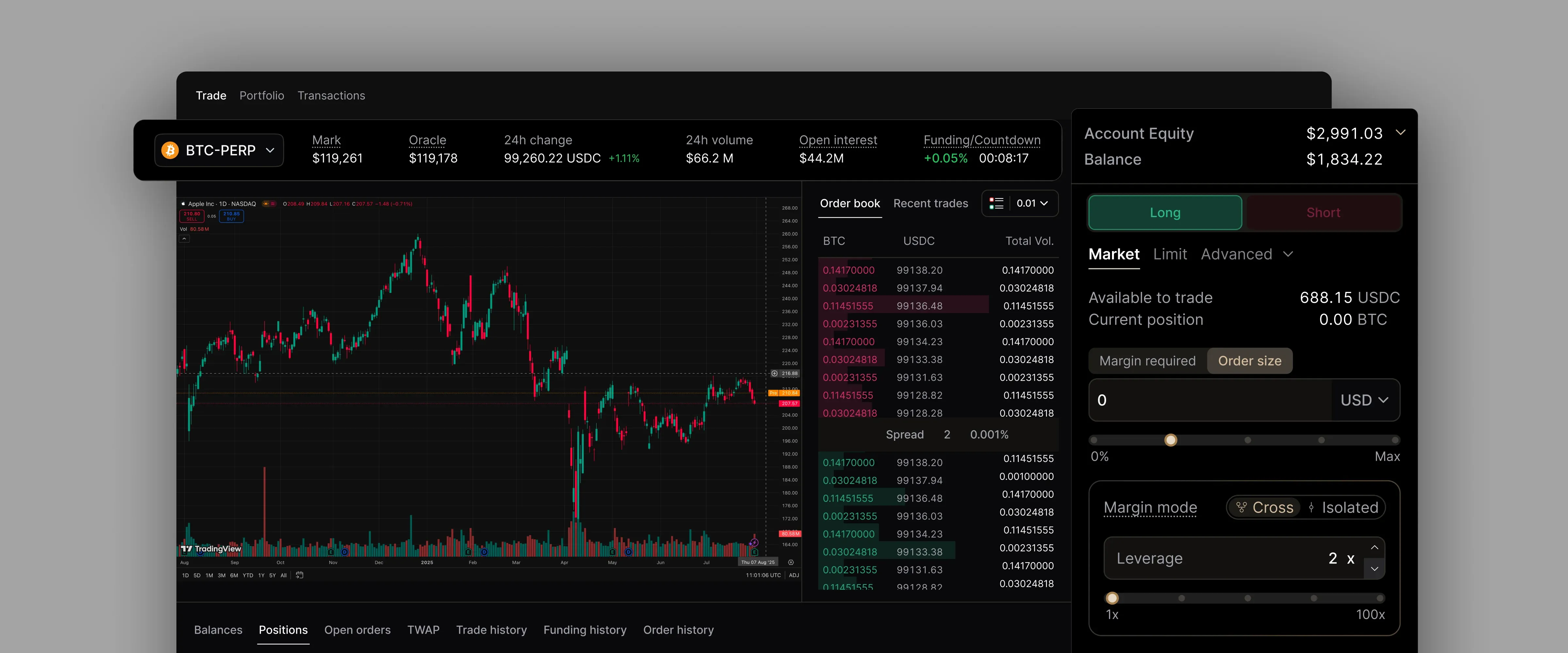
Phoenix perpetuals trading screen with price chart, order book and order form

Phoenix by Ellipsis Labs

Designing One Exchange for Two Ways of Thinking

COMPANY

Phoenix by Ellipsis Labs

SECTOR

Fintech: decentralised finance

THE WORK

Trading UX, interaction modelling and design system for spot trading and perpetuals

Problem

Crypto trading products serve people with very different levels of experience. A newer trader wants a clear, familiar way to place an order and to understand what an amount means before committing to it. An experienced trader wants order types, price controls and market detail within reach. Phoenix needed one trading experience that worked for both, without splitting into two products or hiding the controls its most active users rely on.

Solution

We turned an open question about how a trade should work into two complete prototypes, ready for testing. Then we carried the product logic into a component system and a source-of-truth file the build team could work from.

01 / THE SITUATION

One exchange, two kinds of trader

Phoenix is a decentralised exchange built by Ellipsis Labs on Solana. It runs a fully on-chain order book, which puts the mechanics of a professional trading venue inside a product people use directly from a crypto wallet. That is a lot of market machinery to place in front of a general audience.

Two kinds of trader had to be served by the same screens. An occasional trader needed a clear route in and a way to see the consequence of an amount before placing an order. A frequent trader needed order types, price detail and tolerance settings close at hand, and would notice at once if the product gave up precision for simplicity.

Tcules joined through Kopper as part of the design team for about ten months. The work began with a Portfolio view of balances, assets and positions, then grew into spot trading, mobile, theming, the design system and, later, perpetual futures. As the product widened, the useful question stopped being how to finish individual screens. It became which interaction model could hold the product together, and that question sat inside the trade form, the one part every trader uses:

  • How much should a newer trader see before placing an order?
  • Where do advanced order types live without crowding the form?
  • Should a trade feel like buying from a market, or swapping from a wallet?

02 / THE REAL QUESTION

Is a trade a purchase or a swap?

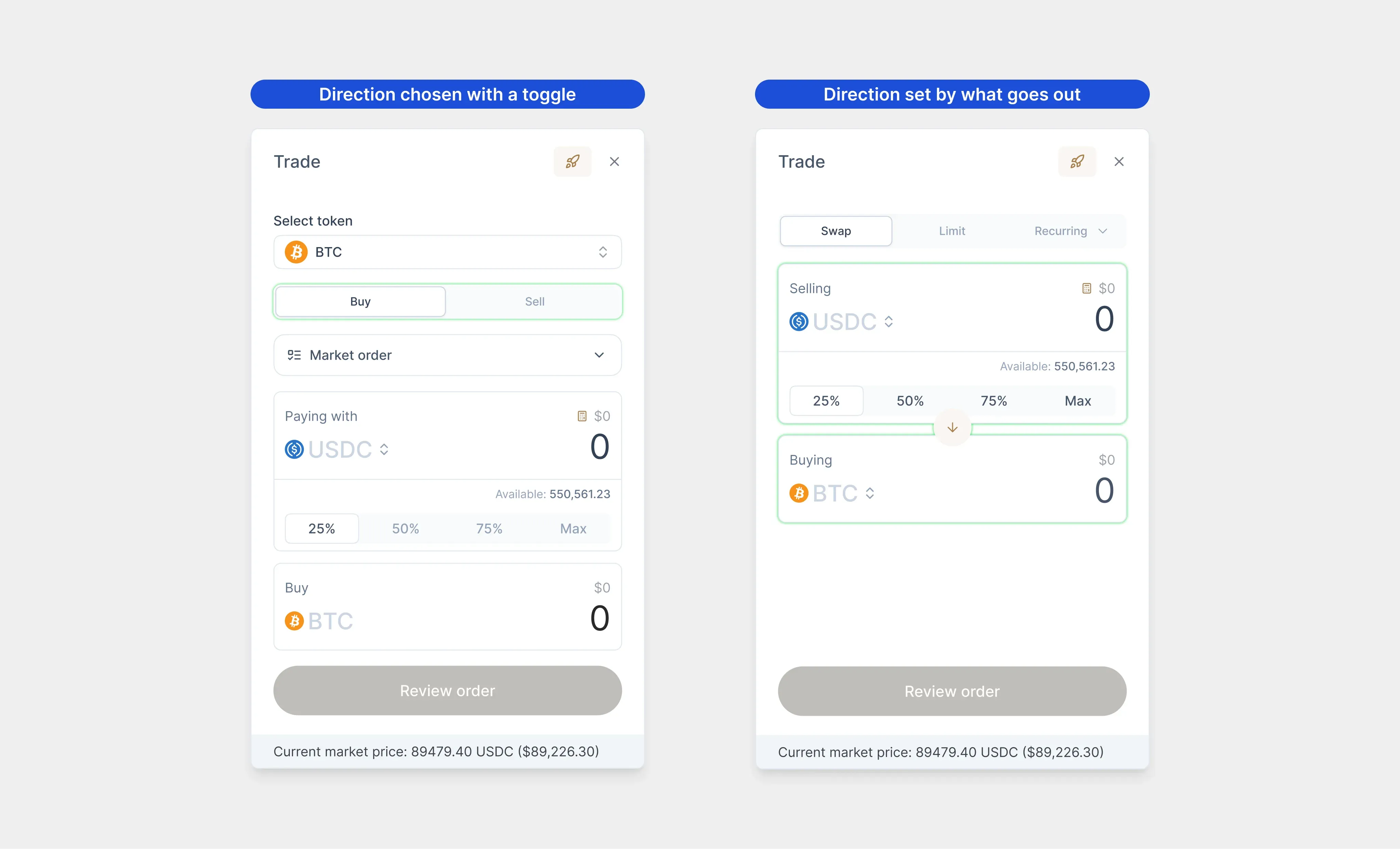
Two models were credible. Buy/Sell is market-centred and works like a brokerage: choose buy or sell, pick the asset, enter an amount. In/Out is wallet-centred: choose what leaves your wallet and what comes back.

It looks like a wording choice. In practice it produces two different forms. Buy/Sell needs a direction toggle at the top. In/Out removes it, because the order of the two assets already says which way the trade goes, and either asset can be changed in place. The model decides which control leads the form, how the two assets relate, what a direction switch is allowed to do, and where advanced order conditions can live.

In a specialist product, vocabulary is part of the architecture. It carries the user’s picture of what they are doing.

Buy/Sell trade form with a direction toggle beside the In/Out form, where Selling and Buying set the direction

The same trade in both models, at the same scale. Buy/Sell leads with a direction toggle; In/Out lets what goes out carry the direction.

03 / THE DECISION

Build both properly, then test

Choosing in a review meeting would have replaced an open question with the most senior opinion in the room. Instead, both models were built as clickable prototypes, from the asset page through to order review, and prepared for user testing.

A comparison is only worth running if neither side has been quietly under-built. So both prototypes carried the same depth: filled forms, review screens, an asset changed midway through, success and timeout states. The difference a tester noticed had to be the product model, not the finish of one prototype.

THE PRODUCT DECISION

The trading model was not settled by opinion. Both options were made real enough to test, so evidence could decide.

That gave Phoenix a better object to decide with. Stakeholders were no longer weighing two explanations. They could operate both models and follow each one through a real order.

The test findings are not part of the material we hold. What is public is the product itself: the live Phoenix perpetuals form today leads with a Long/Buy and Short/Sell toggle, the market-centred model. In perpetuals a trade opens a leveraged position, so the wallet-centred swap form had less to offer there. Whether the spot test pointed the same way, we cannot say.

04 / MAKING IT HOLD

Every order type, not just the easy one

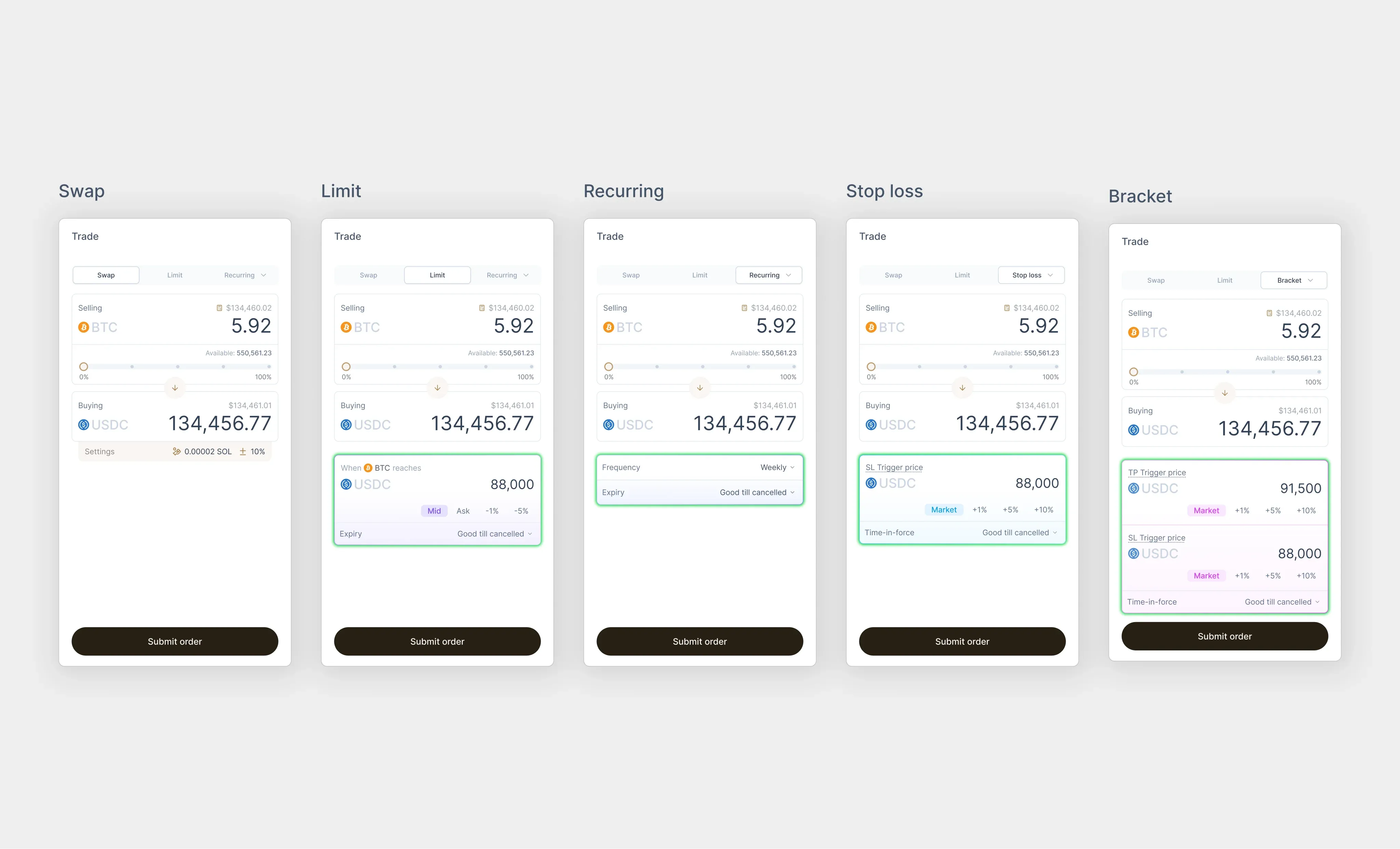
A simple market order makes any design look good. The real test comes later: a limit order that waits for a price, a recurring buy, a stop loss, and a bracket order with both take-profit and stop-loss triggers. Each adds fields, rules and states that the form has to absorb without turning into several unrelated products.

Each order type was designed in both models, in empty and filled states, with review, success and timeout screens behind them. The logic was defined once and expressed across variants instead of being redrawn screen by screen, so gaps surfaced early, while they were still cheap to fix.

Experience levels were handled by sequence, not by removal. Newer traders saw their balance up front, a small set of common controls and a calculator that showed what an amount meant before the order was placed. Experienced traders could open advanced settings when they needed them. The domain stayed intact; the form revealed it one step at a time.

The In/Out trade form across five order types, with the part that changes for each highlighted

Five order types in the In/Out model, filled in. The highlight marks what changes for each one; everything else stays where the trader expects it.

05 / MAKING IT BUILDABLE

A clear line between standard and specific

Phoenix used shadcn, an open-source component library, as its foundation, which gave design and engineering a shared starting point. What still needed defining was the point where the product stops being generic.

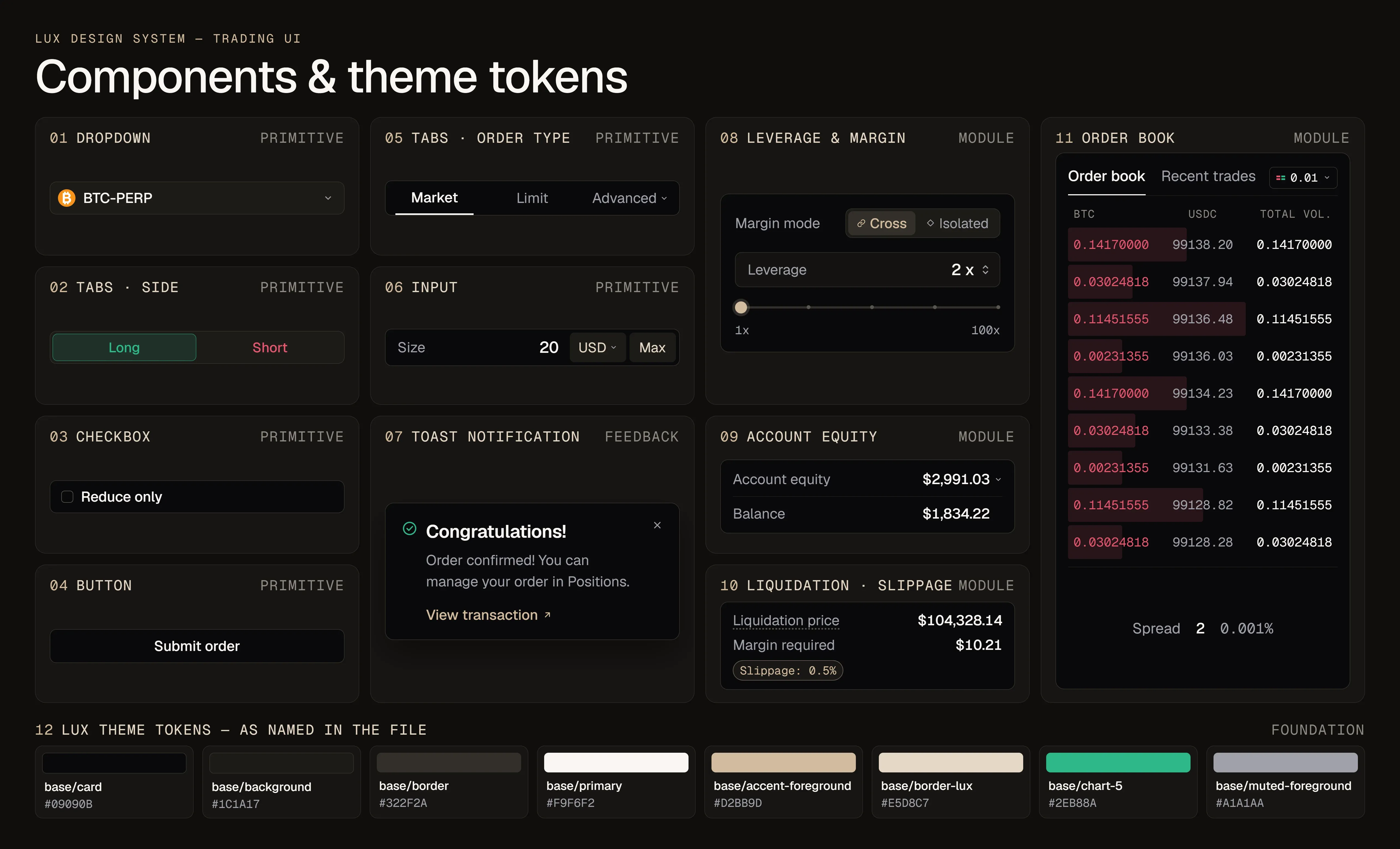
We separated the standard components engineering already had from the trading-specific parts that needed building, so a developer could tell at a glance what existed and what did not. Custom variants were documented, and screen-size rules were written down instead of implied. Theme colours became tokens, and work moved into one source-of-truth page only once it was ready for development, with working files kept out of it.

We did not own the codebase, and the aim was narrower than that: leave engineering less to reconstruct from static screens. Design intent is rarely lost in one dramatic mistake. It slips when a state is missing, a custom component looks standard, mobile behaviour is assumed, or a working file is read as the approved one.

Lux design system board: trading components labelled as primitive, feedback or module, above eight named theme tokens

Six primitives, one feedback pattern, four trading modules and eight Lux tokens, each labelled by layer, so a developer can see what is standard and what is built for trading.

06 / WHERE IT STANDS

Handed over, ready to build

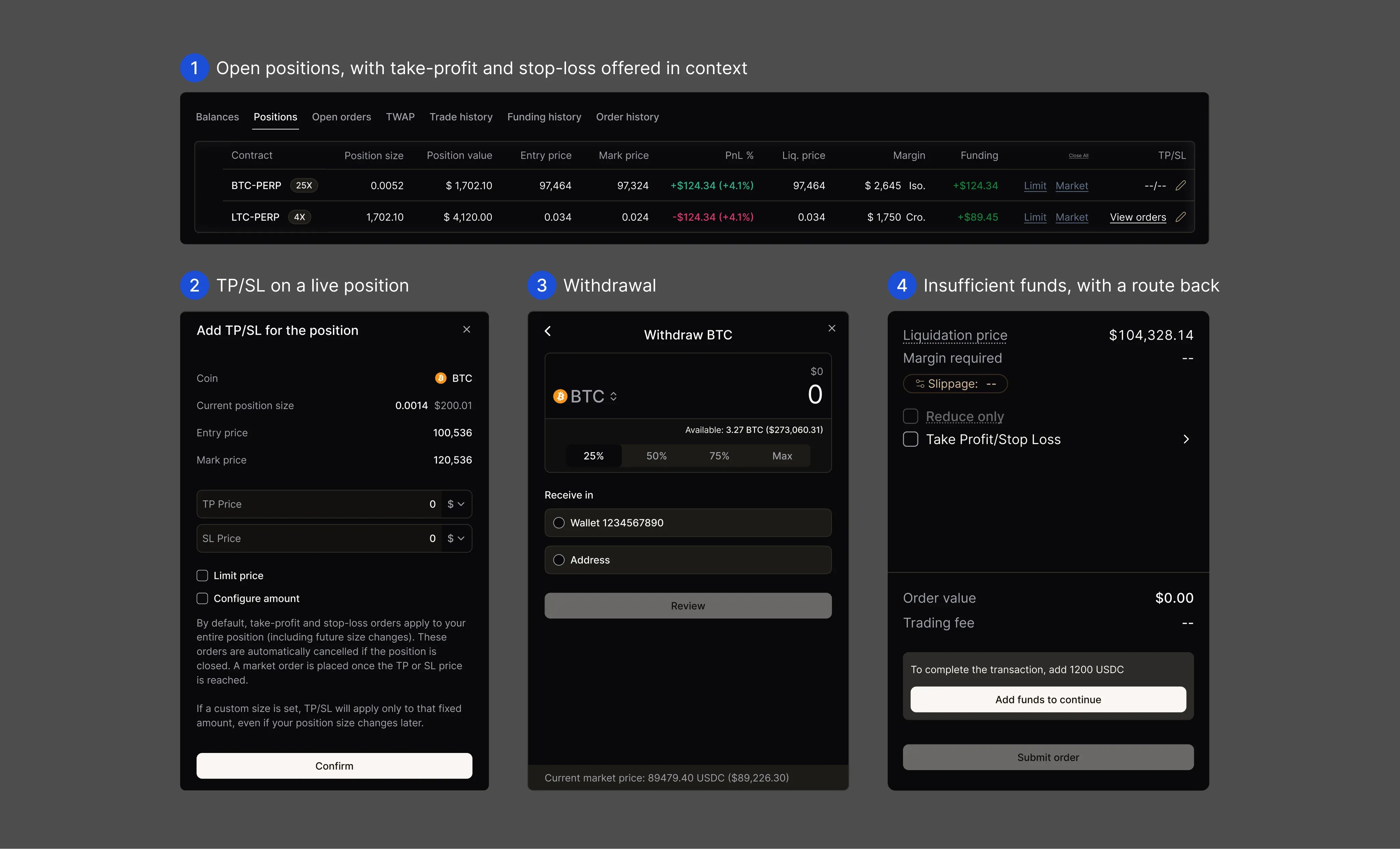
The engagement widened into liquidity products, mobile, dark mode and then Phoenix Perpetuals. Perpetuals added leverage and margin, open positions, take-profit and stop-loss on a live position, deposits, withdrawals and a clear route back when funds run short. The visual language moved on, but the method stayed the same: understand the product logic, express it through complete states, and place it in a system another team can pick up.

Phoenix Perpetuals was publicly announced around Solana Breakpoint 2025 and entered private beta.

Perpetuals flows: positions, take-profit and stop-loss on a live position, withdrawal and insufficient funds

Perpetuals flows designed in the same system: positions, take-profit and stop-loss on a live position, withdrawal, and recovery when funds run short.

Towards the end, Phoenix’s incoming in-house designer joined for a month of knowledge transfer. We folded in the changes that came out of it and completed the design and development handoff in January 2026. What was built after that belonged to the in-house team, so this case shows the product decisions and the handoff, not trading metrics or the in-house work since.

WHAT THIS PROVES

In a specialist product, the words on a button can decide how the whole product works.

While that choice is still open, polishing one direction only looks faster until the first serious order type exposes the mismatch. The better route is to make the alternatives real enough to test, then carry the chosen logic through components, screen sizes and implementation guidance.