Blick compact sport calendar beside its match cards, showing live, upcoming and finished games

Ringier (Blick, cash.ch, Bilanz)

Designing One Match Card for Every Sport

COMPANY

Ringier (Blick, cash.ch, Bilanz)

SECTOR

Media and publishing

THE WORK

Embedded product design across sport, subscription, onboarding and roadmap concepts

Problem

Readers come to Blick, cash.ch and Bilanz for news, sport, finance and long reads, often several times a day. Ringier runs these brands on shared technology, so a component designed for one can appear on all of them. That is a real advantage, and it raises the bar for every design request. A card, a page or an email has to work for the brand that asked for it and for the brands that may use it next.

Solution

We worked as an embedded design partner with Ringier’s teams across more than thirty projects. Starting with the Blick match widget, we designed each piece around what every case shares, so it could serve more than one sport, page or brand.

01 / THE SITUATION

Three brands built on one foundation

Ringier is a Swiss media group whose brands include Blick, a daily news and sport title, the finance site cash.ch and the business magazine Bilanz. The brands share technology and a design system, so improvements on one can reach the others. For a group of content and knowledge platforms, that is a strong foundation to design on.

Tcules joined as an embedded design partner, working alongside Ringier’s editorial, product, growth and platform teams. By January 2026 we had worked on more than thirty projects together, from sport and personalisation to subscription and AI search. Some began as research questions, some as roadmap concepts, and most as a short brief from one team.

This case follows the sport widget, where the approach is easiest to see, and then shows the same thinking in subscription and onboarding. Three questions run through it:

  • What does every sport have in common during a live event?
  • How does a reader compare subscription plans at a glance?
  • What should someone see in their first days after registering?

02 / THE REAL QUESTION

What does every sport have in common?

Blick’s match widget was designed first for football and ice hockey, the natural place to start for a Swiss sport audience. Its card shows two teams, the score and the state of the match, and it appears in articles, on team pages and on the home screen. The brief was to bring handball, tennis, Formula 1, alpine skiing and Schwingen into the same widget.

Each of those sports keeps score differently. Tennis counts sets and games, Formula 1 lists positions and time gaps, and skiing ranks racers across two runs. A widget per sport would have matched each one closely, and given readers five layouts to learn.

What the sports share is the shape of an event. Every match, race and run has a before, a live phase and an after. So the question became how much of the card could be shared across sports, and how little needed to change for each one.

03 / THE DECISION

Share the states, adapt only the score

We weighed three directions: a card for each sport, one generic card that left sport detail out, and shared states with a sport-specific score area. The first would have meant a new design for every new sport. The second gave fans less than they came for. The third kept the frame, the status and the actions identical, and let only the score area adapt.

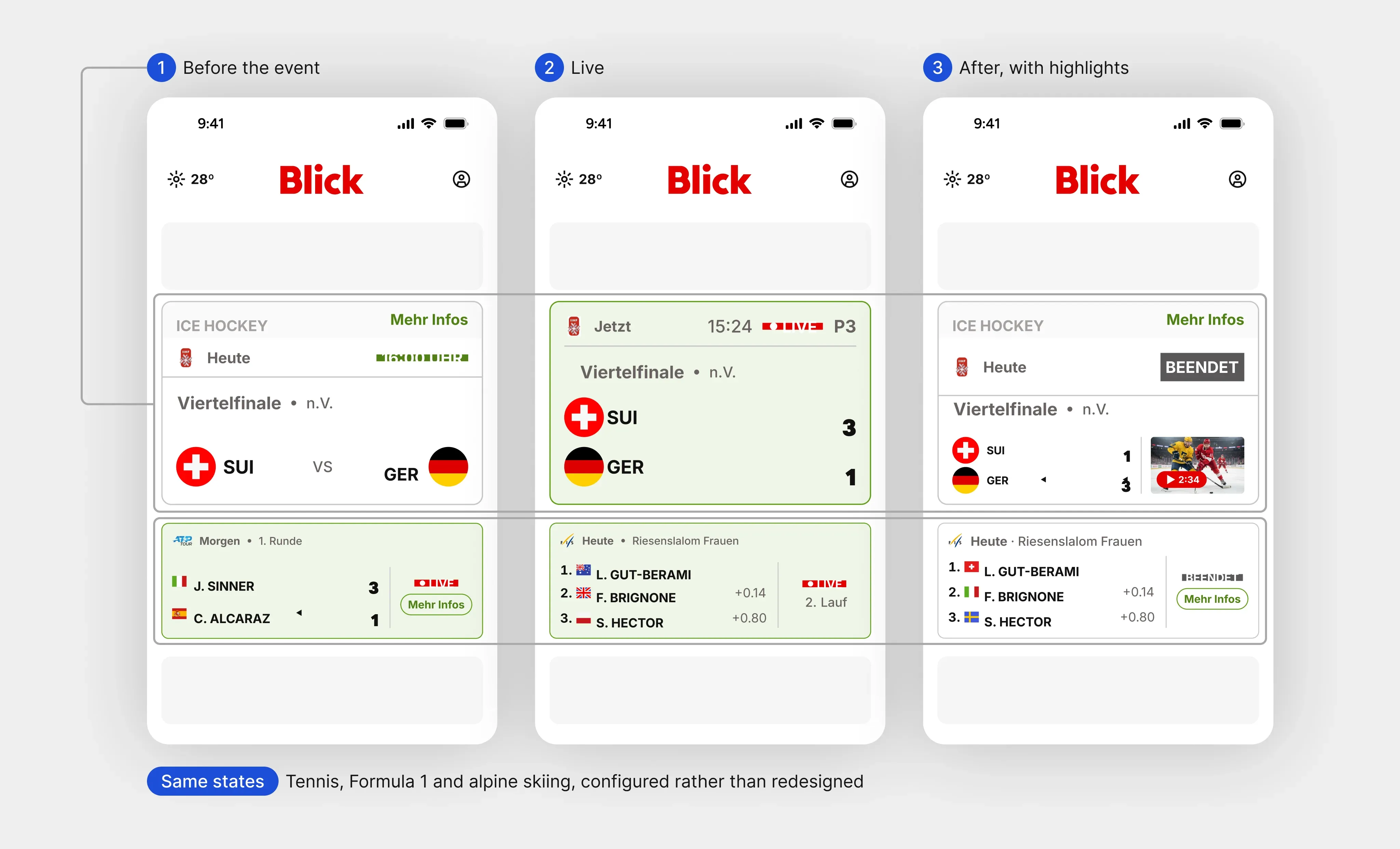
Before the event, the card shows the start time and a link to more information. Live, it turns green, carries a live label and shows the running score, period or lap. Afterwards, it shows the final result and, where one exists, a highlights video.

THE PRODUCT DECISION

Every sport shares the same three states, and only the score area changes from one sport to the next.

Match widget for ice hockey before, during and after a game, with live states for tennis, Formula 1 and alpine skiing

One widget, three states. The same states carry tennis, Formula 1 and alpine skiing; only the score area changes.

04 / MAKING IT HOLD

Full fields, sets and stages in one card

The harder cases tested the model. Races with a full field instead of two opponents, qualifying sessions and multi-stage events each needed their own score layout, and each fitted inside the same three states. For Formula 1 and skiing the score area became a ranked top three with time gaps. For tennis it became a row per set.

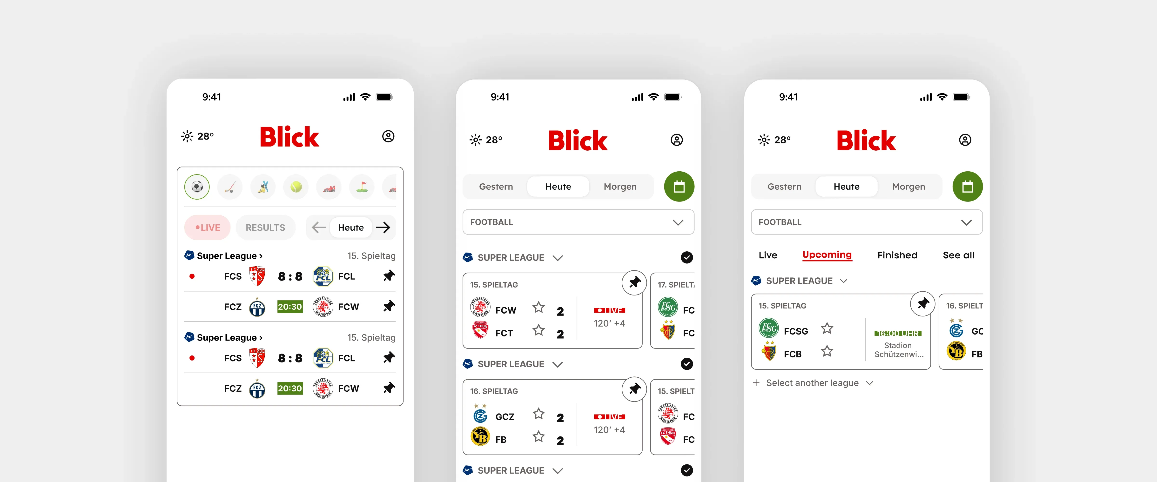
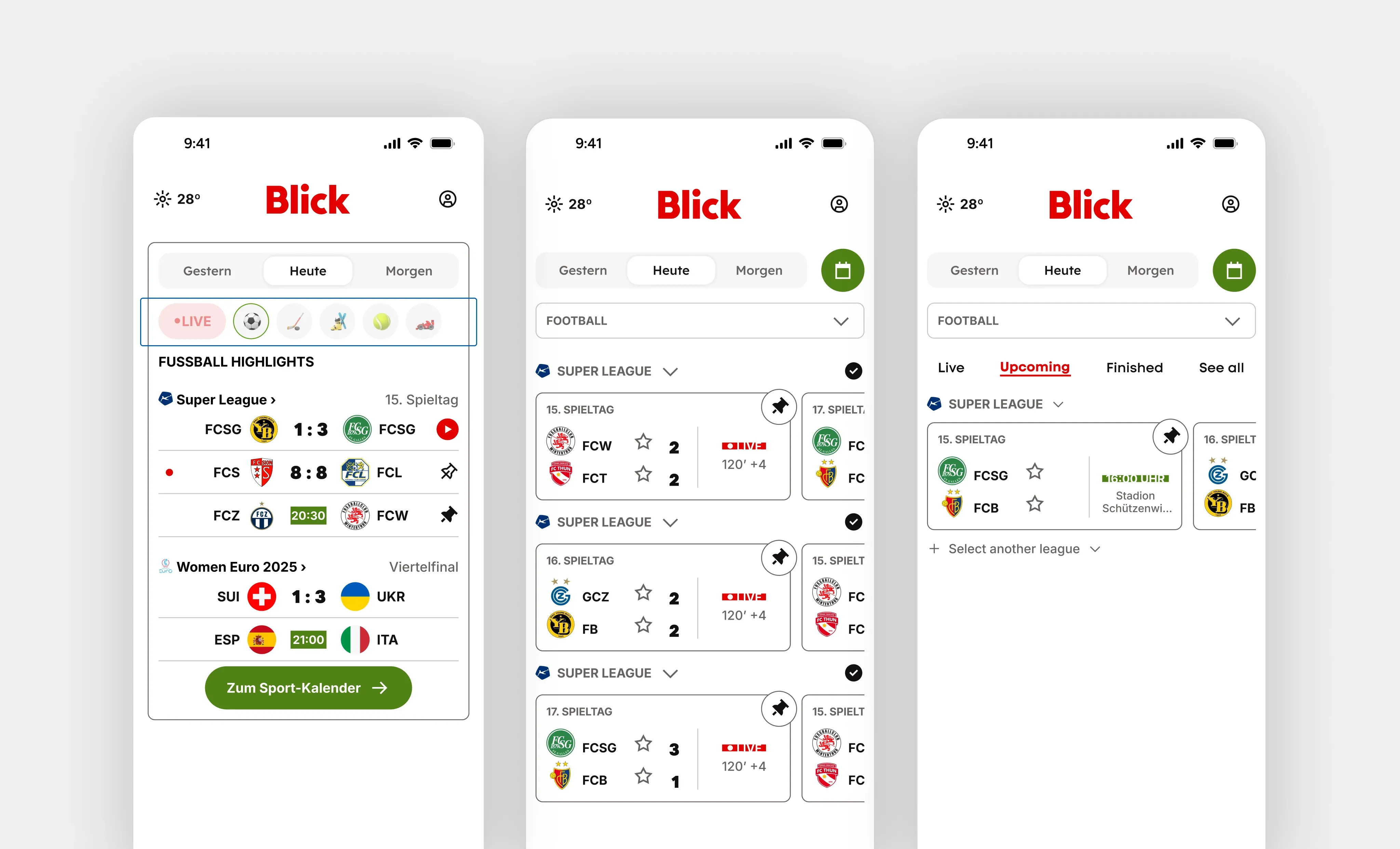
The same cards then fed a compact sport calendar for the home screen. Readers switch between yesterday, today and tomorrow, filter by sport or by live events, and pin the teams they follow. One button leads to the full sport calendar, which keeps the home screen short.

Compact sport calendar on three Blick home screens: all sports, one league, and upcoming games with pinned teams

The compact sport calendar uses the same cards, with filters for sport, live games and the teams a reader follows.

The same approach shaped other shared components, such as an image gallery designed once for mobile, desktop and full screen, and a recipe page built to work for every brand.

05 / THE READER’S FIRST STEPS

The same thinking, from offer page to inbox

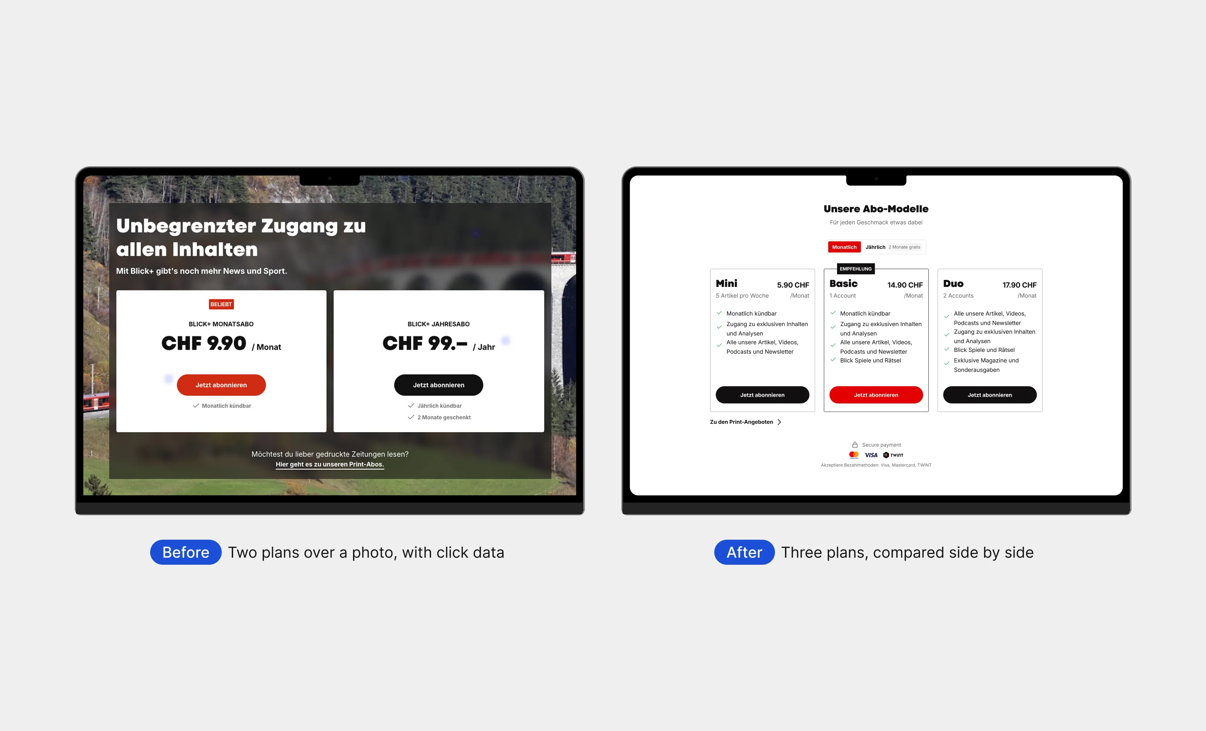
On the Blick+ offer page, research came first. We studied mobile-first offer pages that present several plans, and used Ringier’s own click data to see where readers looked and acted. The page at the time offered a monthly and a yearly plan, and the new subscription model introduced three.

The redesign places Mini, Basic and Duo side by side on the Blick design system, with a monthly or yearly switch above them. Each plan lists its benefits in the same order, so the differences stand out. The layout was built to be reused across brands.

Blick+ offer page with research click data, beside the redesign with three plans compared side by side

The Blick+ offer page at the time, with Ringier’s click data, beside the three-plan design at the same width.

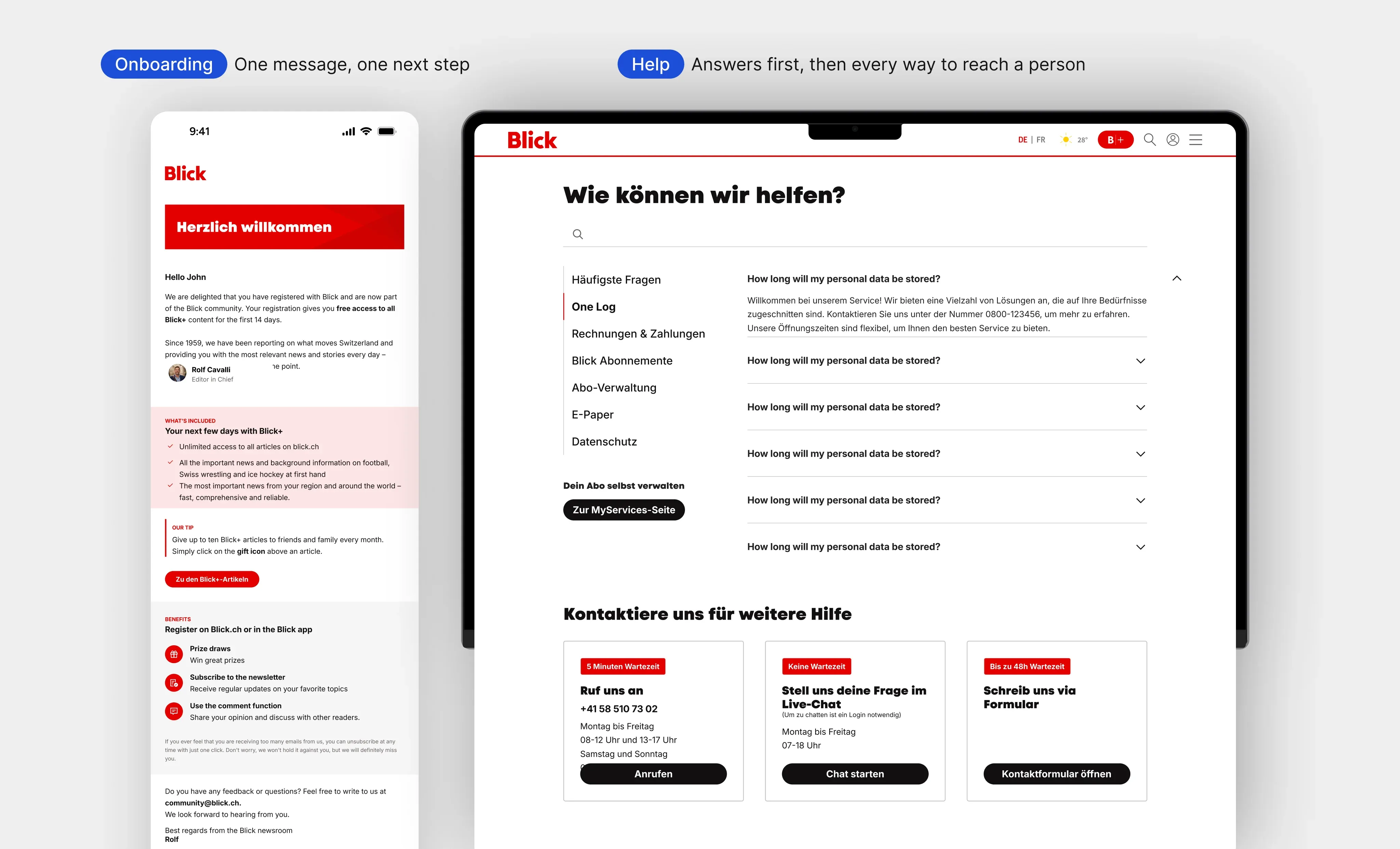
The same principle applied to the first days after someone registers. We designed a four-email welcome sequence, each email built around one next step. The help page leads with answers, then shows phone, chat and form side by side. It came in two variants, one for the current support platform and one for a future setup, and the MyServices page was designed alongside it.

Redesigned Blick welcome email beside the redesigned help page with its contact options

A welcome email built around one next step, and a help page that leads with answers, then every way to reach a person.

06 / WHERE IT STANDS

Handed over, with concepts for what comes next

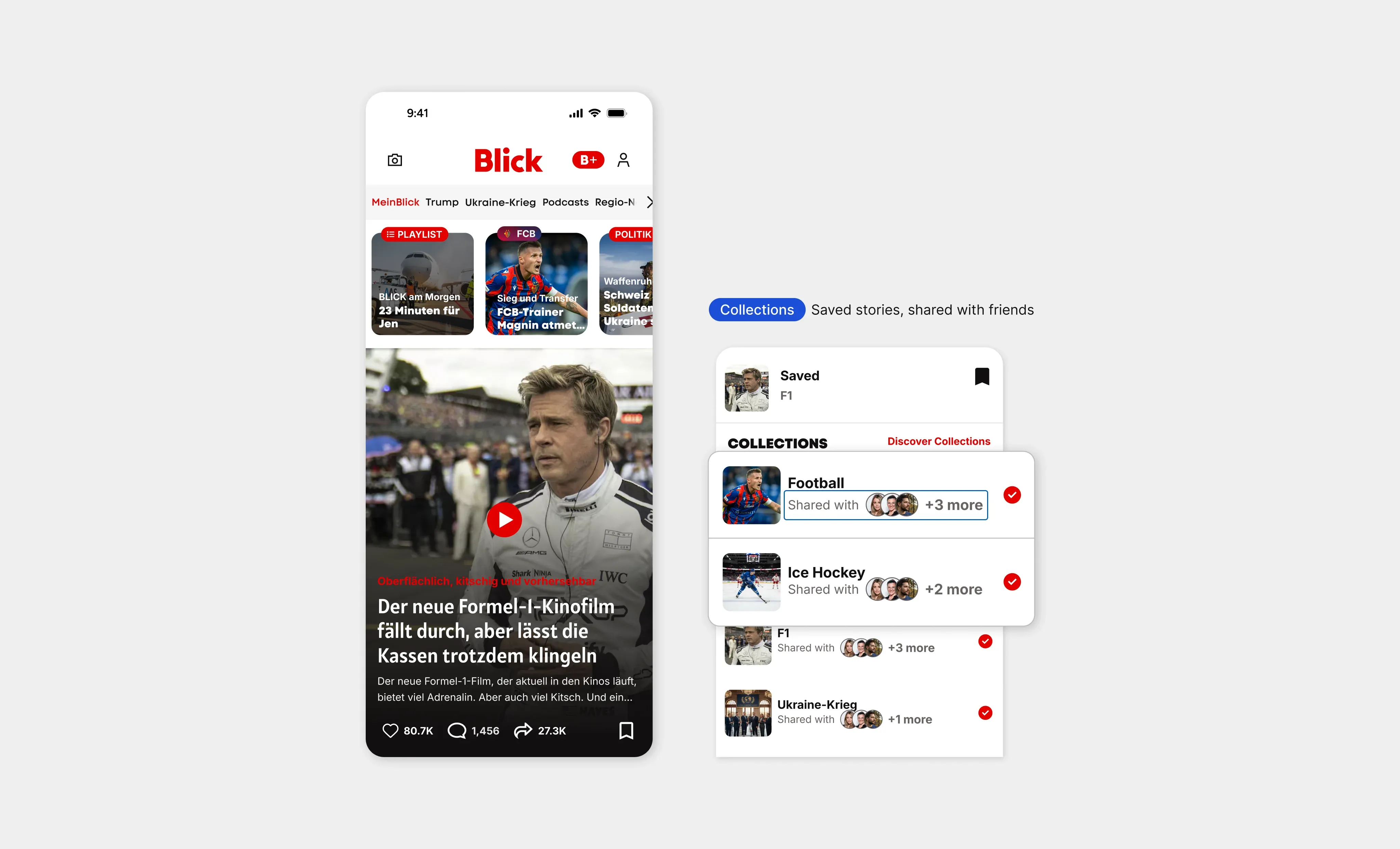
Ringier’s teams also used the collaboration to think ahead. For the Blick roadmap, we designed mobile concepts and a prototype that follow one reader from onboarding to a personalised home screen. On the way, readers find a personal mix of news, easier sharing, and collections that friends can follow together. For AI search, we designed flows that pair an answer with its source articles and a route into a personal digest.

Blick roadmap concept: a home feed with reactions and saving, beside collections shared with friends

A roadmap concept for Blick: stories readers can react to, save into collections and share with friends.

Research supported these concepts, including a review of how Swiss and international publishers approach personalised feeds, and a study of how personal-finance media attract and keep readers, for cash.ch. This case shows the design work and the way of working behind it, not adoption, engagement or subscription results.

WHAT THIS PROVES

In a multi-brand product, design for what every case shares.

Ringier’s shared technology made reuse possible. Designing around what every sport, plan or reader moment has in common is what makes one widget, page or email worth reusing.