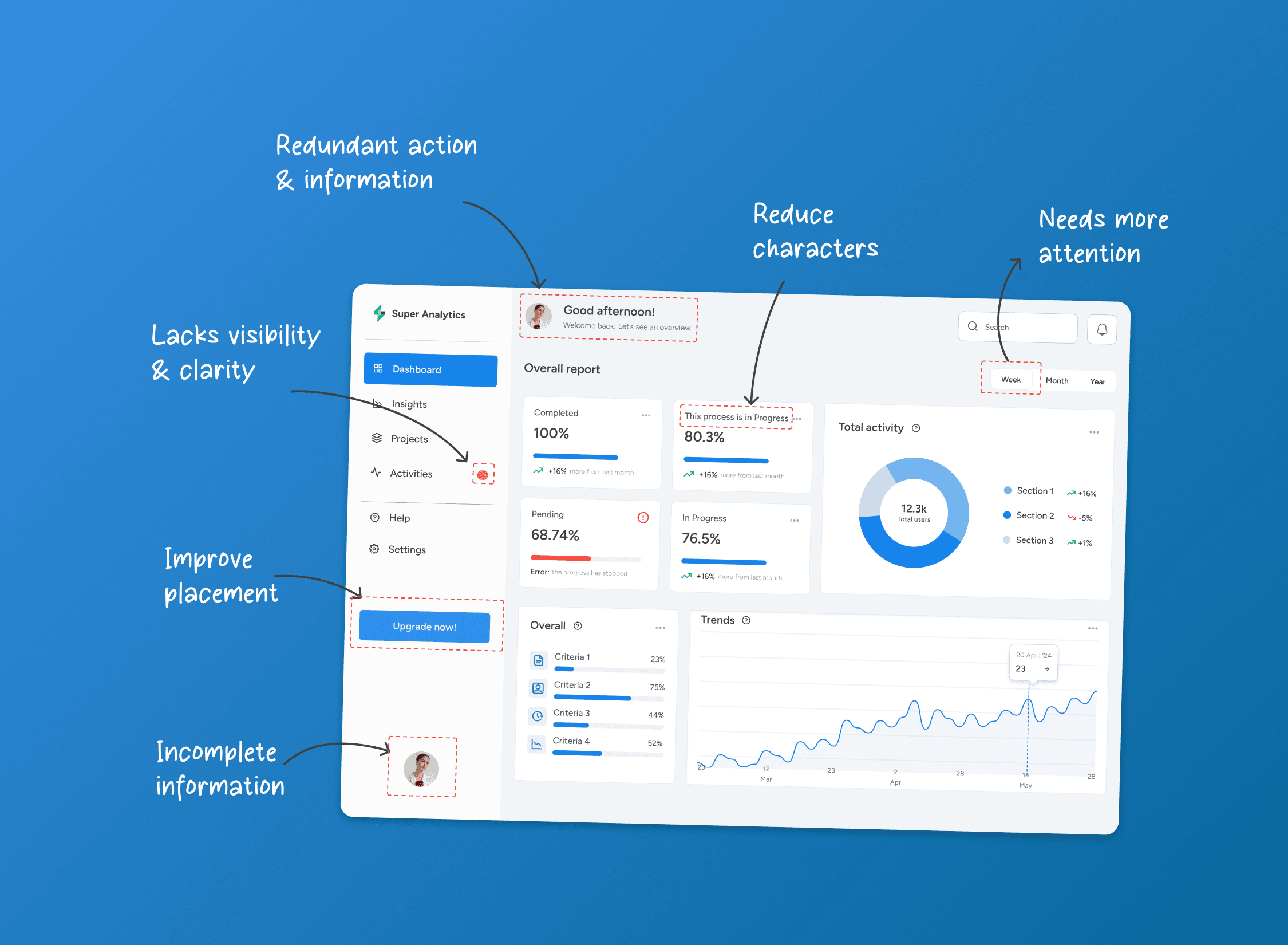
A heuristic evaluation template with a 0 to 4 severity scale, a rule for scoring consistently, and three worked SaaS findings. Includes the process and limits. A heuristic evaluation is an inspection: two or more evaluators go through a product on their own, note every place it breaks a recognised usability principle
The short answer
A heuristic evaluation is an inspection: two or more evaluators go through a product on their own, note every place it breaks a recognised usability principle, and then merge and rate what they found. The template below is the table we would use, and the three worked findings show what a filled row looks like. The severity scale comes from Jakob Nielsen, and we explain how to apply it so two people rate the same problem the same way.
One view before the detail. Listing issues is the quick part of this method, and tools can now produce a long list in seconds. What still takes judgement is rating severity consistently, tying each finding to evidence and a consequence, and naming who should act. So the template is built around those columns, not around the heuristic names.
The method is Nielsen and Molich's, from their 1990 CHI paper on heuristic evaluation of user interfaces. The ten heuristics in common use are the ones Nielsen published in 1994, and their substance has not changed since.
How to run the evaluation
Our process has six steps. The first two and the last are where most evaluations go wrong.
- Scope it. Choose one task, section, user group or device, not "the product". "Invite a teammate and set their role" is a scope. "The app" is not. A narrow scope is what lets two evaluators compare like with like.
- Choose evaluators and a heuristic set. Three to five evaluators, each working independently, is the Nielsen Norman Group's guidance in "How to Conduct a Heuristic Evaluation". Use Nielsen's ten unless your product has a reason to add domain rules, such as permissions or audit trails in an admin tool. Run a short practice round so everyone reads the heuristics the same way.
- Do an independent pass. Each evaluator goes through the task once to learn the flow, then a second time to log violations. The same guidance puts a session at roughly one to two hours per evaluator. Nobody compares notes yet.
- Merge. Put every evaluator's findings into one list and group duplicates. Keep the original wording from each evaluator in the evidence column, so a merge does not quietly flatten a disagreement.
- Rate severity separately. Nielsen's advice is to rate on your own, after the finding sessions and not during them, because during them evaluators should be looking for new problems. Each evaluator receives the merged list with enough description and screenshots to judge problems they did not find themselves.
- Report. Average or reconcile the ratings, assign an owner to each finding, and sort by severity. The report is the table, with a short summary above it.
The template
Copy this into a spreadsheet or a document table. It is a table to fill in, not a download.
| Column | What goes in it |
|---|---|
| ID | A short reference, such as HE-01. |
| Heuristic | Which of the ten is violated. If two apply, pick the one that explains the fix. |
| Location | Screen, step and state, for example "Team settings, invite dialogue, empty state". |
| Observation | What happens, in one factual sentence. No opinion words such as "confusing". |
| Evidence | Screenshot reference, evaluator names, and any data you hold (support tickets, analytics, session recordings). |
| Frequency | How often users meet it: rare, occasional or on the main path. |
| Impact | How hard it is to get past: a slowdown, a detour, a dead end or a wrong outcome. |
| Persistence | Whether users learn to avoid it, or meet it afresh each time. |
| Severity (0 to 4) | The rating, set after the factors above. |
| Recommendation | The change you would test, stated as an outcome. |
| Owner | The role that should decide: design, engineering, content or product. |
Two columns do most of the work. Evidence is what separates a finding from an opinion, and it is the column that lets someone outside the team trust the row. Owner is the column most templates leave out, and without it a finding has no route to a fix.
Rating severity consistently
Nielsen's scale has five points. The table below summarises it in our words; the original wording is in the Nielsen Norman Group's "How to Rate the Severity of Usability Problems".
| Rating | Meaning |
|---|---|
| 0 | Not a usability problem at all. |
| 1 | Cosmetic only; fix if time allows. |
| 2 | Minor; low priority. |
| 3 | Major; important to fix, high priority. |
| 4 | Catastrophe; imperative to fix before release. |
Nielsen says the rating combines three factors: frequency (how often it occurs), impact (how hard it is to overcome) and persistence (whether users hit it once and learn, or keep hitting it). He also suggests weighing market impact, because a problem that is easy to overcome can still hurt how a product is received.
Nielsen does not publish a formula that turns the three factors into a number. The rule below is ours, a working convention to make scoring repeatable, not part of his method.
- Start from impact. A dead end or a wrong outcome starts at 3. A detour starts at 2. A slowdown starts at 1.
- Raise by one if it sits on a main path (high frequency) or if users meet it again every time (high persistence). Raise by one at most, not twice.
- Lower by one if it is rare and users learn past it after the first encounter.
- Cap at 4 and keep 4 for problems that stop a task or cause irreversible harm, such as data loss or an unintended charge.
- Write the three factor values in the row, so a disagreement is about a factor and not about a gut feeling.
Then check the scores. Single-evaluator ratings are unreliable, and Nielsen's experience is that averaging the ratings of three evaluators is adequate for many practical purposes. Where two evaluators differ by two points or more, discuss the factors, not the number.
Three worked findings
These rows are written on a generic SaaS product to show the format. They are illustrations, not results from any client or audit of ours.
HE-01: inviting a teammate
| Column | Entry |
|---|---|
| Heuristic | Visibility of system status |
| Location | Team settings, invite dialogue, after "Send invite" |
| Observation | The dialogue closes with no confirmation, and the pending invite does not appear in the members list until the page is refreshed. |
| Evidence | Screenshots 4 and 5; both evaluators sent the invite twice; support tickets tagged "invite" would confirm the pattern. |
| Frequency | On the main path for every new account |
| Impact | Detour: users resend, and the invitee gets duplicates |
| Persistence | Repeats each time an invite is sent |
| Severity | 3 (impact starts at 2, raised one for the main path) |
| Recommendation | Show a confirmation and add the pending invite to the list at once. |
| Owner | Engineering, with design for the message |
HE-02: changing a billing plan
| Column | Entry |
|---|---|
| Heuristic | Error prevention |
| Location | Billing, plan change, confirmation step |
| Observation | Downgrading from an annual to a monthly plan shows the new price but not the date it takes effect or what happens to seats above the new limit. |
| Evidence | Screenshot 9; one evaluator proceeded believing the change was immediate. |
| Frequency | Occasional |
| Impact | Wrong outcome: an unintended change to the account |
| Persistence | Met once per plan change |
| Severity | 3 (impact starts at 3; occasional frequency adds nothing, and a one-off exposure does not lower a wrong outcome of this kind) |
| Recommendation | State the effective date and the seat consequence before the final button. |
| Owner | Product and content |
HE-03: removing a member
| Column | Entry |
|---|---|
| Heuristic | User control and freedom |
| Location | Team settings, member row menu |
| Observation | "Remove" sits directly under "Change role" and acts at once, with no confirmation and no undo. |
| Evidence | Screenshot 12; one evaluator removed the wrong member during the second pass. |
| Frequency | Occasional |
| Impact | Wrong outcome: access lost, work reassigned |
| Persistence | Repeats for anyone who uses the menu |
| Severity | 4 (impact starts at 3; raised one for persistence; it can cut access for a working person) |
| Recommendation | Separate the destructive action, add a confirmation naming the person, and offer undo. |
| Owner | Design |
Note what each row carries that a bare issue list does not: where it happens, what we saw, how we know, how bad it is and why, and who decides.
What this method cannot tell you
Be plain about the limits when you present the report.
- Evaluators miss things, and disagree. Single evaluators find only part of the problems, which is why Nielsen recommends several. Across six case studies in 1992, Nielsen found that one evaluator caught a given major problem about 42 per cent of the time, and a given minor one about 32 per cent.
- Agreement is low. A study in which four evaluators analysed the same four recorded sessions found 93 problems, with only 20 per cent found by all four, and no problem appeared on all four evaluators' lists of their ten most severe problems. That study analysed usability tests, not inspections, so read it as a warning about severity judgements, not a measure of heuristic evaluation.
- It predicts, it does not observe. The report lists likely problems. Nobody has watched a user fail. When a decision is expensive, or evaluators disagree on the biggest items, test those items with users.
- It is not accessibility conformance testing. That is a different method, tested against WCAG.
When to use something else
A cognitive walkthrough asks a different question. Instead of checking a screen against principles, the evaluator walks a task step by step and asks four questions from Wharton, Rieman, Lewis and Polson (1994): will the user try to achieve the right effect, notice the correct action, connect it to their goal, and see progress after taking it. It suits learning for first-time users. A heuristic evaluation covers a wider surface faster, and the walkthrough goes deeper on one task. The two answer different questions, so they can be combined.
For choosing between an audit and an evaluation, read UX audit versus heuristic evaluation. For the checks to run in each workflow, we keep a separate SaaS UX audit checklist, and how to use a UX product audit covers acting on the report. If you would rather buy an evaluation than run one, see what you should get from heuristic evaluation services, and our UX product audit is the service behind this method.
About the authors

Rushali Bhatt
Product Designer
More from RushaliRushali Bhatt is a Product Designer at Tcules. Rushali's articles start from the people inside complex software: clinicians and patients in healthcare products, users who cannot take part in research sessions, and the reviewers who check an AI feature's output before anyone acts on it. Topics include usability studies for enterprise software, human-in-the-loop patterns, a readiness checklist for AI product UX, what to fix first when adding AI to a live SaaS product, and what a heuristic evaluation should deliver. Useful reading for product teams whose software people rely on to make decisions.
Yash Gidwani
Product Designer
More from YashYash Gidwani is a Product Designer at Tcules who writes about getting people into a SaaS product and keeping them there. Yash's guides cover SaaS onboarding strategies, onboarding and engagement software, and redesigning a live product without upsetting the people who use it. Other articles go into specific workflows: lending and loan origination apps, insurance quoting and claims, staffing and recruitment software, and a search-first create flow that stops duplicate records. Yash has also co-written the SaaS UX audit checklist and a 20-question checklist for legacy modernisation readiness.